Building Dropdown Lists in Flutter: Simplifying Option Selection
How to add and customize a DropdownButton in Flutter, from project setup to styling and handling selection state.

Introduction
Dropdown lists or menus are a common UI element used in mobile applications to provide users with a selection of options. In this article, I’ll walk through adding a DropdownButton in Flutter, a popular framework for building cross-platform mobile apps, and cover how to create and customize a dropdown in Flutter.
Set up a Flutter Project
Ensure that Flutter is installed on your machine and set up a new Flutter project by following the official Flutter documentation.
Import the Required Packages
Open your Dart file and import the necessary Flutter packages to use the DropdownButton widget:
import 'package:flutter/material.dart';Define the DropdownButton Variables
Declare a variable to hold the current selection and a list of the options the user can choose from:
String selectedOption = '';
List<String> dropdownOptions = ['Option 1', 'Option 2', 'Option 3'];
Implement the DropdownButton Widget
In the build method of your widget, add the DropdownButton widget and configure its properties:
DropdownButton<String>(
        value: selectedOption.isEmpty ? null : selectedOption,
        isDense: true,
        onChanged: (String? newValue) {
          setState(() {
            selectedOption = newValue ?? '';
          });
        },
        items: dropdownOptions.map((String value) {
          return DropdownMenuItem(
            value: value,
            child: Text(value),
          );
        }).toList(),
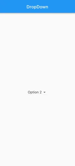
      ),
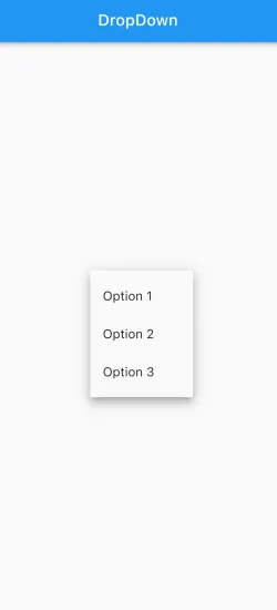
Customize the DropdownButton
It doesn’t look so good, does it? But you can further customize the DropdownButton’s appearance by modifying its properties. For instance, you can change the dropdown icon, text style, or dropdown menu alignment according to your preferences.
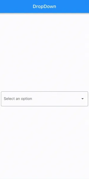
With a little bit of customization
FormField<String>(
        builder: (FormFieldState<String> statee) {
          return InputDecorator(
            decoration: InputDecoration(
                errorStyle:
                    const TextStyle(color: Colors.redAccent, fontSize: 16.0),
                hintText: 'Select an option',
                border: OutlineInputBorder(
                    borderRadius: BorderRadius.circular(5.0))),
            isEmpty: selectedOption == '',
            child: DropdownButtonHideUnderline(
              child: DropdownButton<String>(
                value: selectedOption.isNotEmpty ? selectedOption : null,
                isDense: true,
                onChanged: (String? newValue) {
                  setState(() {
                    selectedOption = newValue ?? '';
                  });
                },
                items: dropdownOptions.map((value) {
                  return DropdownMenuItem<String>(
                    value: value,
                    child: Text(value),
                  );
                }).toList(),
              ),
            ),
          );
        },
      ),
Conclusion
The Dropdown widget can be used in your Flutter app to show and select a single value from a large set of options. If you want just a simple dropdown which doesn’t need any customization like adding validation and other stuff you can go with DropdownButton. If you are required to apply more style and if the dropdown comes under the Form widget, it is better to use FormField because it has more customization along with inbuilt validation support.
Comments
Questions, corrections or your own experience — leave a comment below (GitHub sign-in).